Back to work

CASE 03

Digital Learning Platform Design

Skill Up · Level Up · Lead On

Suup is a hands-on digital learning platform that moves beyond theoretical education. Through integrated workshops and mentoring, the experience empowers students to work in teams, apply their knowledge, and solve real-world challenges across a mobile app and a web platform.

MY ROLE
Product Designer
TEAM
1 Product Designer 3 Developers
DURATION
5 months
TOOLS
Figma, FigJam, Miro
Digital Learning Platform Design

Impact at a glance

CHALLENGE

Designing one cohesive ecosystem for students, instructors, and administrators across both mobile and web.

MY APPROACH

I built a scalable design system and aligned mobile + web interfaces under a single visual language driven by UX principles.

OUTCOME

A consistent, scalable platform that improved cross-platform usability and accelerated future feature work.

ABOUT PROJECT

Suup is a collaborative digital environment where students explore new technologies and develop practical skills through workshops, mentoring, and team-based learning. The product combines two surfaces: a mobile application designed for students to track course progress, take exams and access learning resources; and a web platform built for administrators and instructors to create, organize and update content while monitoring student progress. My role was centered on interface design, visual direction, and the creation of a scalable design system shared across both surfaces, with UX principles informing key decisions throughout the process.

CHALLENGES

  • Designing for multiple user types — students, instructors, and administrators — each with different goals and workflows
  • Maintaining visual consistency across mobile and web platforms with distinct interaction patterns
  • Balancing usability and visual clarity in interfaces with varying levels of information density
  • Building a design system flexible enough to scale as the platform grows

ACHIEVEMENTS

  • Created a comprehensive design system that ensured consistency, efficiency, and scalability across the platform
  • Delivered polished, high-fidelity mobile and web interfaces aligned under a single visual language
  • Improved cross-platform usability through clear visual hierarchy and reusable components
  • Strengthened collaboration by providing a shared visual foundation that supports future iterations and feature expansion

The process

DISCOVER

Understanding users & use cases

DEFINE

Rapid wireframing & interface alignment

DESIGN

Visual direction & UI exploration

VALIDATE

Design system & component library

DELIVER

Mobile & web interface design

DISCOVER

Understanding users & use cases

Designing for different roles within a single ecosystem

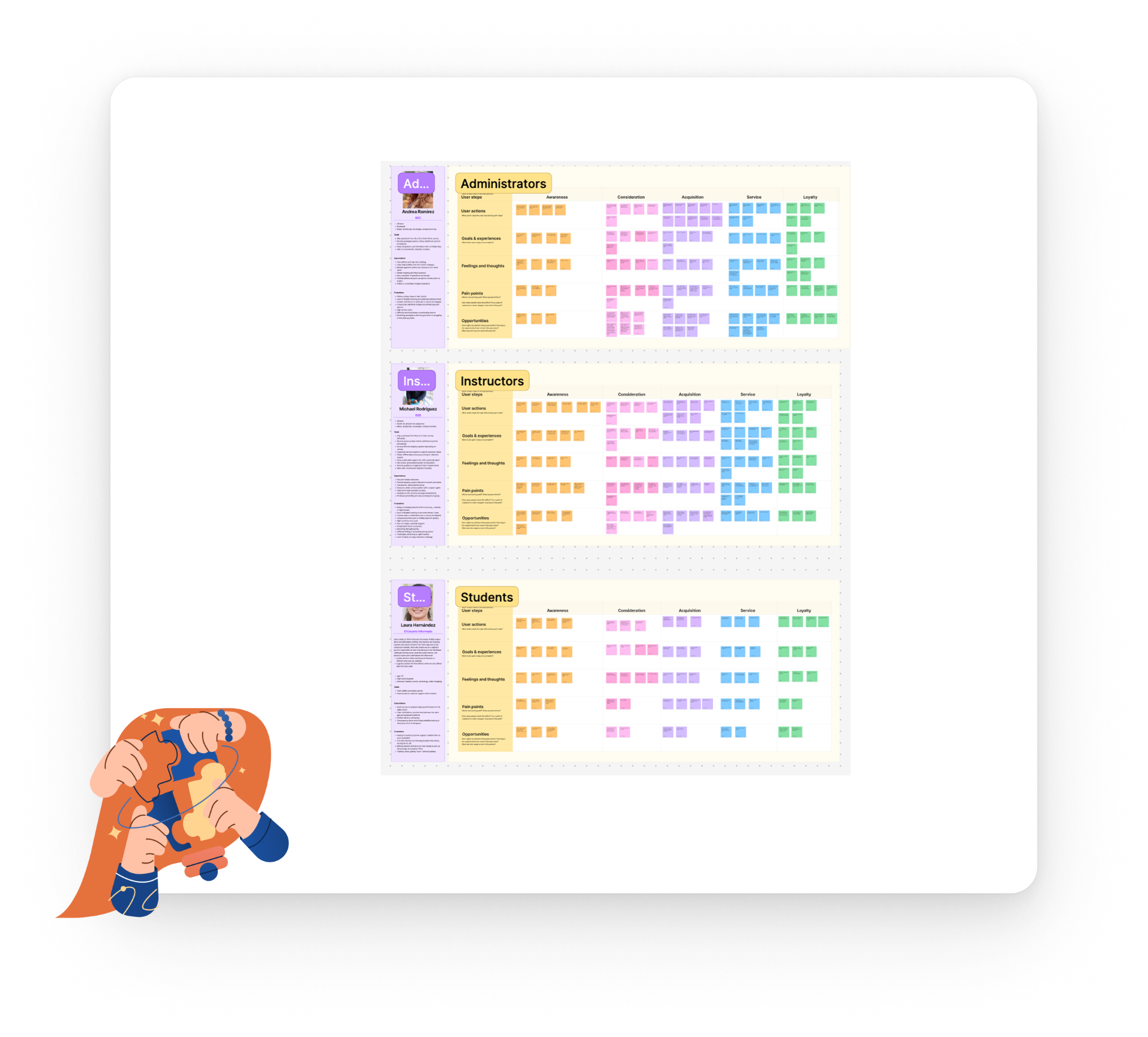
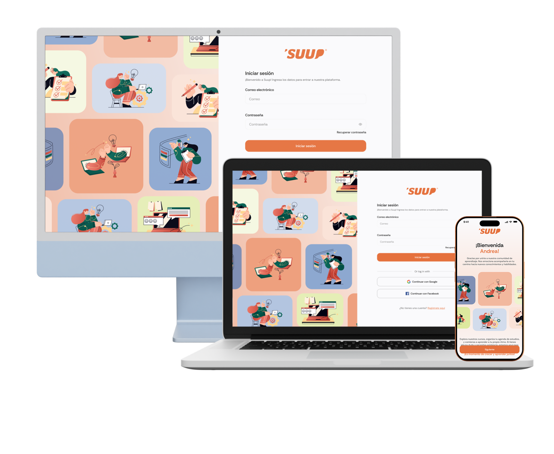
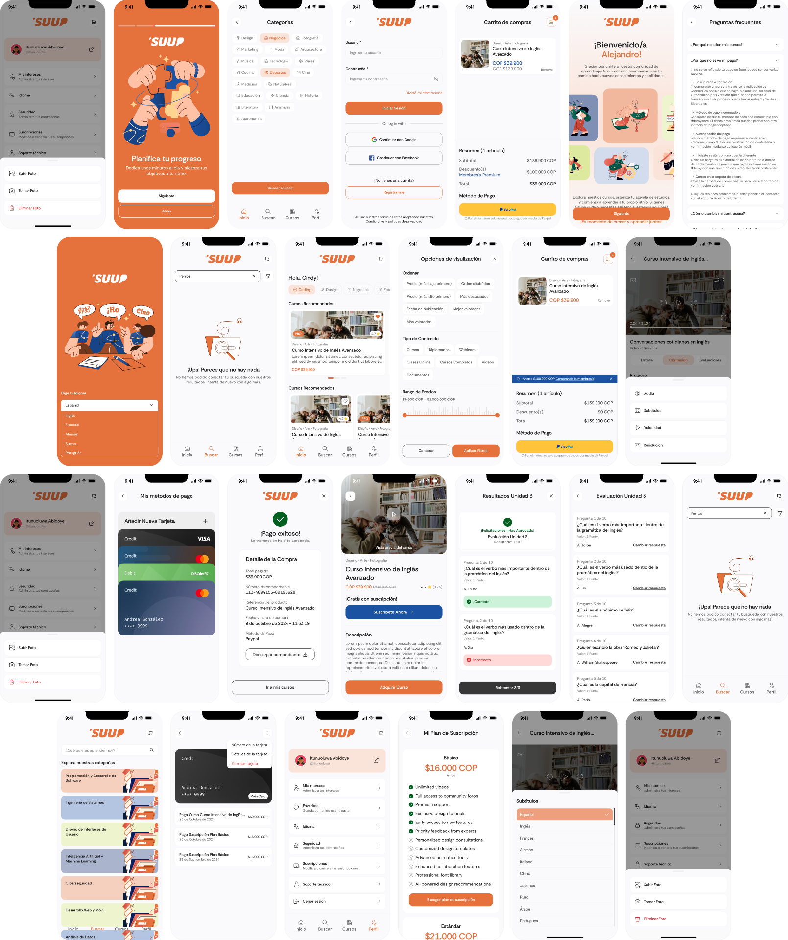
Through a series of user interviews, I identified the platform's main user groups — students, administrators, and professors — in order to better understand their needs, goals, and pain points. These insights helped reveal how each group interacts with the platform and where friction occurs. Based on this research, I mapped the overall experience using a journey map, which allowed us to visualize key moments, user motivations, and opportunities for improvement across the different stages of platform use.

  • Students — focused on learning, collaboration, and task completion
  • Instructors — responsible for mentoring, guiding, and tracking progress
  • Administrators — managing programs, content, and users
Understanding users & use cases visual

DEFINE

Rapid wireframing & interface alignment

Using wireframes to explore and validate decisions quickly

Before moving into high-fidelity design, I focused on creating wireframes as a fast and flexible way to test layout ideas, navigation patterns, and content hierarchy across both mobile and web platforms.

  • Quickly explore multiple layout options without visual constraints
  • Validate core flows and navigation early in the process
  • Identify structural issues before investing in detailed UI design
  • Align interface decisions across platforms from the start
Rapid wireframing & interface alignment visual

DESIGN

Visual direction & UI exploration

Shaping the look and feel of the product

At this stage, the focus shifted toward visual design and interface exploration. I explored different UI approaches to define the visual direction before formalizing it into a system.

  • A clean, modern aesthetic aligned with educational and collaborative environments
  • Strong visual hierarchy to guide users through complex content
  • Consistent interaction patterns adaptable to both mobile and desktop
Visual direction & UI exploration visual

VALIDATE

Design system & component library

Building a scalable and reusable visual system

The design system served as the foundation for the interface work in this project. Rather than focusing only on visual styles, the system was built through a componentization process where patterns were identified, standardized, and documented to ensure scalability and consistency across the product. This included style guidelines such as color palettes, typography, and grid systems, as well as a library of reusable components like buttons, inputs, cards, navigation elements, and feedback states. By documenting these patterns and components, the team was able to design and iterate faster while maintaining consistency across screens and features.

Design system & component library visual

DELIVER

Mobile & web interface design

Applying the system across platforms

Using the design system, I designed key screens for both mobile and web platforms. Despite platform differences, both experiences shared a unified visual language.

  • Mobile — simplicity and prioritization of essential actions with lightweight navigation and clear content flow
  • Web — more complex layouts and information density to support administrative workflows and advanced controls
Mobile & web interface design visual
From discovery to results — the learner flow
Lessons Learned

Lessons Learned

This project reinforced the importance of designing for multiple user types—students, instructors, and administrators—each with distinct goals and needs. Balancing usability across both mobile and desktop platforms was a key challenge, but also an opportunity to create cohesive, intuitive experiences. Through iterative testing and feedback, I learned how critical it is to align design decisions with real user behavior and platform constraints.

Previous case: Design New Onboarding StoreNext case: Application for the learning of children in Mexico