Back to work

CASE 02

Design New Onboarding Store

Product DesignUX ResearchUsability TestingDesign System

I designed the Onboarding Store to transform the standard welcome process into a more personal and engaging experience, empowering new hires to select their own welcome gifts from a curated collection that reflects the company culture.

MY ROLE
Product Designer
TEAM
1 Product Designer 2 Product Manager 4 Developers
DURATION
1 month
TOOLS
Figma, FigJam, Maze
Design New Onboarding Store

Impact at a glance

CHALLENGE

Many organizations struggled to create an engaging and inclusive onboarding experience. Meanwhile, HR teams faced inefficient and inconsistent processes for managing onboarding gifts across regions.

MY APPROACH

I designed an intuitive, brand-aligned store with a guided step-by-step flow, validated through usability testing against a single-page alternative.

OUTCOME

The redesigned step-by-step version was chosen as the MVP, delivering a smoother experience with a 100% task completion rate and a 4.7/5 ease-of-use rating.

ABOUT PROJECT

Achievers is an HR SaaS platform that helps companies drive employee engagement through recognition, rewards, and performance programs. As part of their evolving offering, we introduced a new feature: the Onboarding Store, designed to enhance the new hire experience. The feature allowed companies to offer customizable welcome packages where new employees could choose their own onboarding gifts, making the experience more personal while helping HR teams reinforce company culture from the first day.

CHALLENGES

  • Design a flexible and intuitive experience for new employees unfamiliar with the platform.
  • Ensure companies could customize the store based on brand, location, and budget.
  • Make the redemption process seamless and delightful, while keeping technical limitations in mind.
  • Create a design that supports scalability and international rollouts.

ACHIEVEMENTS

  • Ran an A/B test comparing a feasibility-first design with a more user-friendly version.
  • 100% task success rate on the redesigned step-by-step flow.
  • Convinced the team to include more user-centered features in the MVP.

The process

DISCOVER

Business Discovery & Stakeholder Alignment

DEFINE

User Flows & Requirements

DESIGN

Balancing Feasibility and Usability

VALIDATE

Usability Test Summary

DELIVER

Hand-off & Documentation

DISCOVER

Business Discovery & Stakeholder Alignment

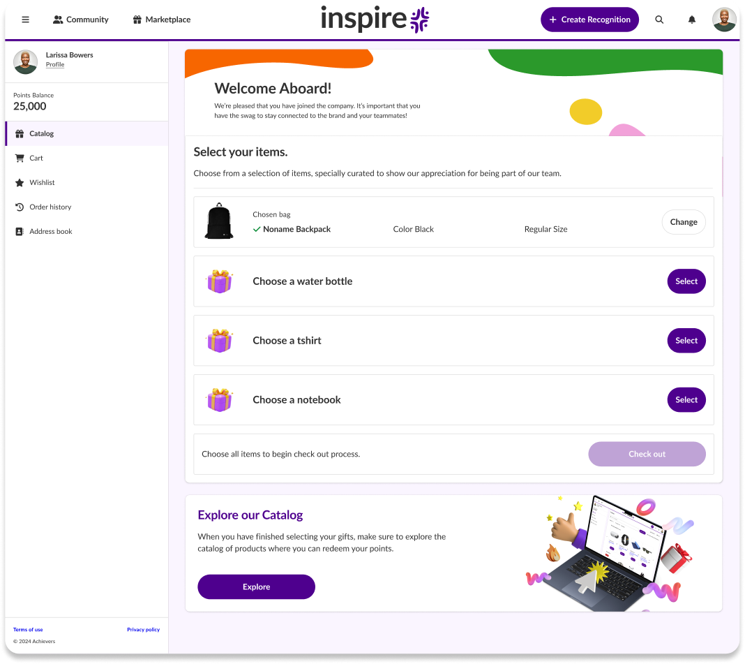
Understanding why the onboarding store was a strategic need

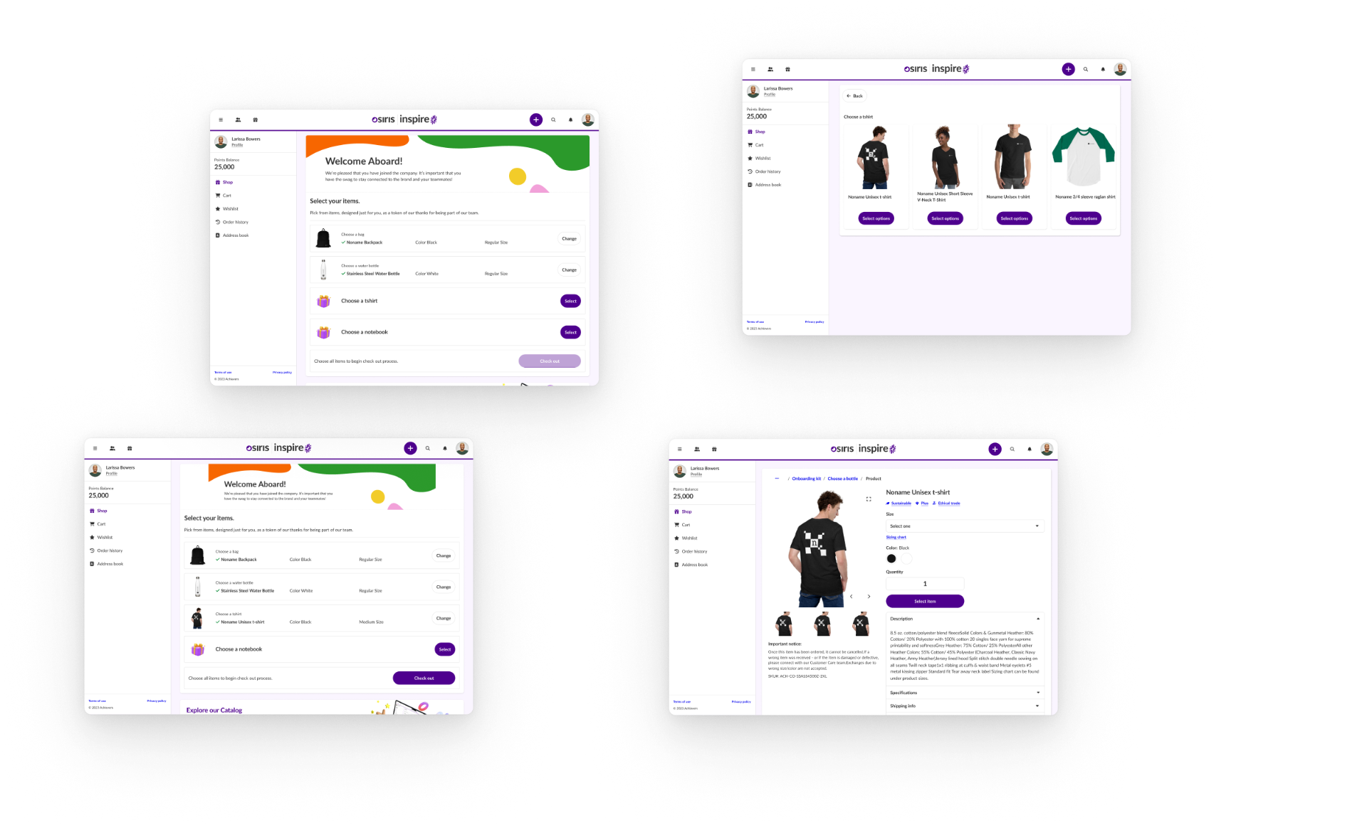
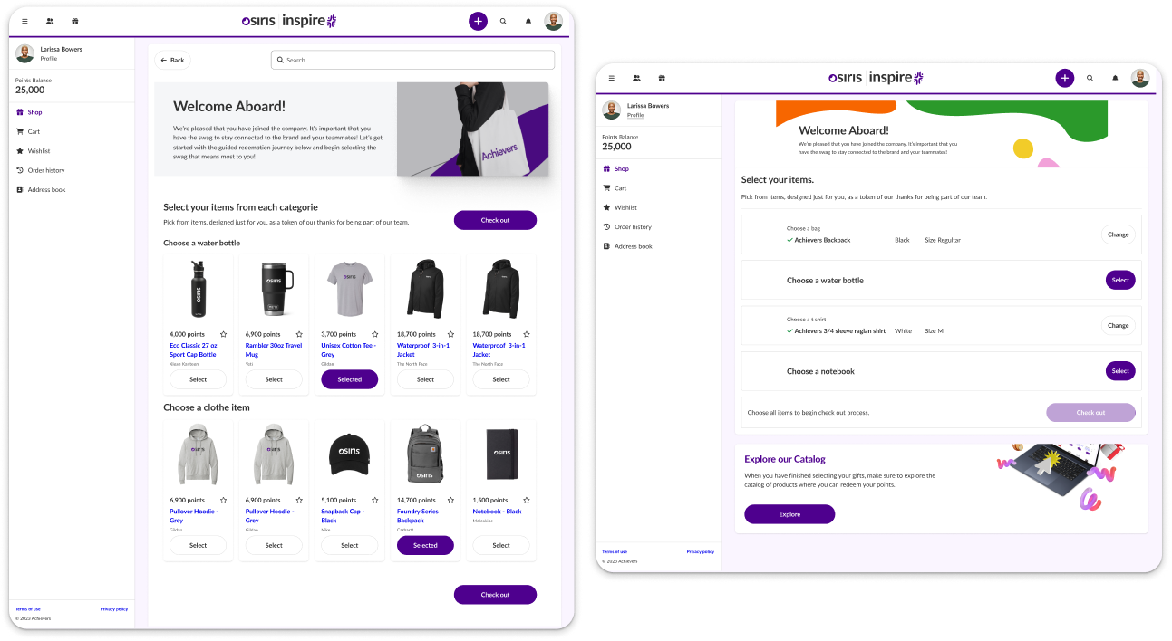
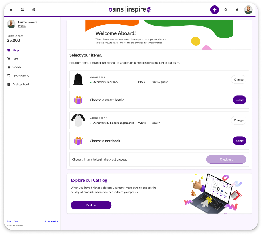
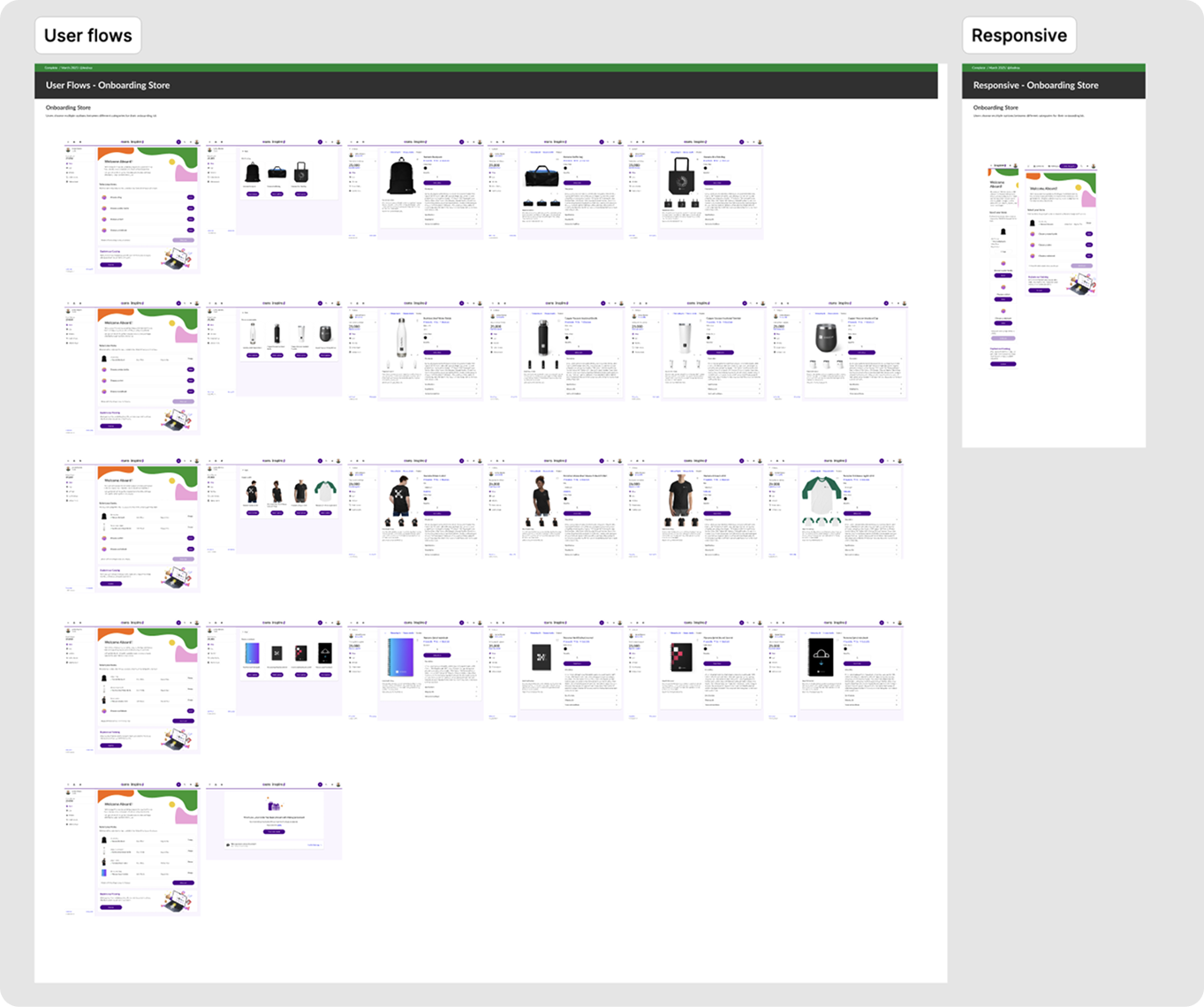
I met with internal stakeholders to understand why the onboarding store was a strategic need. It became clear that offering a personalized welcome kit was key to reinforcing company culture during the onboarding journey. I then explored different user flow proposals to define how the selection process would work, factoring in categories, pricing, quantity limits, and total number of items.

DEFINE

User Flows & Requirements

Mapping the selection logic and constraints

I mapped multiple flow variations to handle category rules, item quantities, budget limits, and edge cases. The goal was to design an experience that felt simple and celebratory while supporting global rollout with localization and branding options for non-tech-savvy users.

User Flows & Requirements visual

DESIGN

Balancing Feasibility and Usability

Before vs. After — advocating for a user-friendly redesign

The development team initially proposed a single-page layout focused on minimizing implementation effort. I challenged that approach and designed an alternative with a clearer structure and guided step-by-step flow. After running usability tests on both versions, the redesigned flow was the clear winner — reaching a 100% task success rate. Participants consistently described the guided experience as easier to follow than seeing every option at once, which became the key argument to move the user-friendly version forward as the MVP.

Balancing Feasibility and Usability visual

BEFORE — Dev-first proposal: all categories and products exposed at once, leaving users to scan a dense grid on their own. AFTER — My redesign: a guided step-by-step flow that walks users through one decision at a time with clear progress. Usability testing played a key role in validating our design decisions. It provided the evidence needed to advocate for a more user-friendly solution, ultimately helping the team align on the best experience for the onboarding store.

VALIDATE

Usability Test Summary

Unmoderated testing with a clickable prototype

I conducted an unmoderated usability test using a clickable prototype to evaluate two layout versions of the onboarding store: a step-by-step flow and a single-page layout. Participants were asked to complete three core tasks: locate the onboarding store, select items, and finalize their onboarding.

  • 100% task completion rate across all three tasks in the step-by-step version.
  • Ease of use rated 4.7 out of 5.
  • The step-by-step version was preferred for its clarity and lower cognitive load.
  • Participants described the guided flow as easier to understand than seeing all options at once.
Usability Test Summary visual

DELIVER

Hand-off & Documentation

A smooth transition from design to development

Once the final design was validated, we prepared the handoff to the development team. The complete flow was documented and delivered in Figma, including desktop and responsive versions. We scheduled a handoff meeting to walk the developers through the prototype, clarify interaction details, and address edge cases. I also provided accessibility documentation to ensure the implementation aligned with WCAG guidelines, covering color contrast, focus states, and keyboard navigation.

Hand-off & Documentation visual

INTERACTIVE PROTOTYPE

Explore the onboarding store prototype

Below is the interactive Figma prototype of the onboarding store experience. You can navigate through the guided step-by-step flow and explore the final design.

PERSONAL CHALLENGES

Advocating for usability over minimal dev effort

One of the biggest challenges was aligning design feasibility with development constraints. Initially, we were asked to simplify the experience to reduce dev effort, but I had to advocate for a design that better supported usability, even if it meant a bit more complexity. Communicating the value of design decisions in terms of user impact and long-term product quality was crucial to align the team and secure buy-in for the MVP version.

LESSONS LEARNED

What this project taught me

Well-executed usability testing can be a powerful tool to support design decisions and influence product direction. Clear documentation, both visual and written, is essential for cross-functional collaboration, especially when working with distributed teams. Designing with accessibility in mind from the start saves time and avoids rework later in the process. Finally, early involvement of developers during the design phase helped identify potential limitations and avoid costly iterations down the road.

Previous case: User Data Management SystemNext case: Digital Learning Platform Design